· · Laura Paplauskaite · 3 min read
Search UX: Good Practices for Organizing and Filtering

The purpose of the search facility is to help users find the specific information they are looking for. This ability is largely determined by the manner in which the results are displayed, making organizing and filtering an area of utmost importance in Search UX.
This is the second in a series of posts on Search UX. In the first, we focused on search forms and the options that make it easiest for users to retrieve information. Today, we will consider the best ways to organise and display search results for an optimal user experience. Let’s start with the basics.
1. Clearly show which results are being displayed.
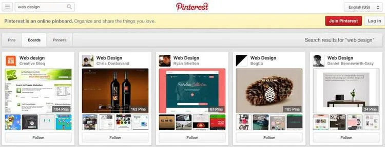
The social networking sites Pinterest and Twitter demonstrate this well, by both writing out the search result (“Results for X”) and leaving the search term in the field:

2. If the results fall into distinct categories, or even different areas of the site, categorising them will make it easier for users to find what they are looking for.
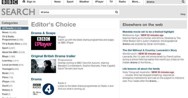
The BBC website does this brilliantly. Search for “drama” on the main page, and the results will be divided into iPlayer, News, TV & Radio Programmes, Blogs, and so on, allowing the user to quickly find the content they desire:
3. It’s common practice to provide further filtering options on the result pages, either on the left sidebar or at the top of the page. Some UX tests suggest that users are more likely to use filters that are placed at the top, but both options are widely used.
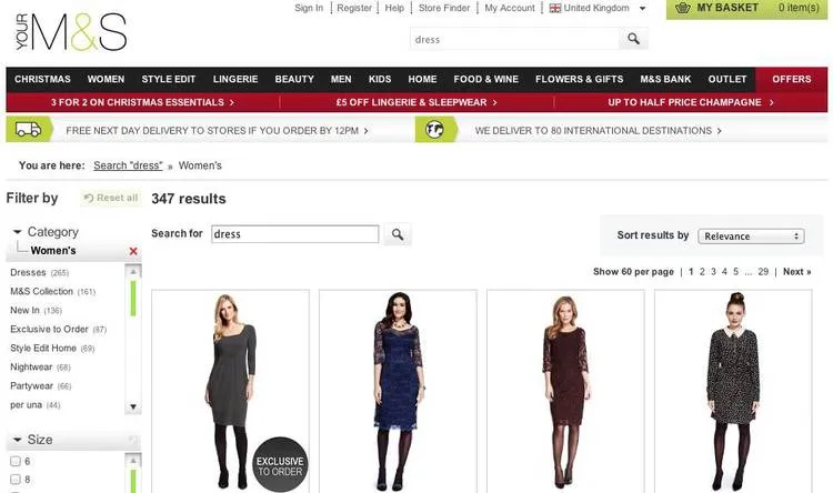
Limit the number of filters so as not to overwhelm users or, if the search facility requires more, collapse some by default. It’s also a nice touch to show the number of items available in each option.
Marks and Spencer’s has a left-side filter, which is partially collapsed and shows the number of items available:
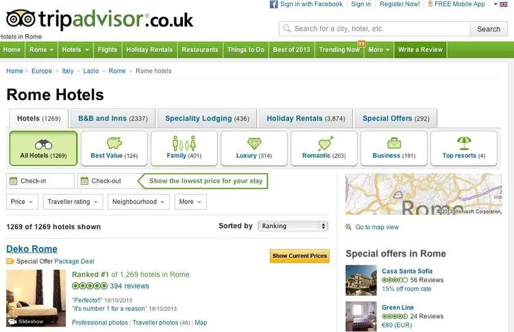
Meanwhile, Trip Advisor has its filter at the top:
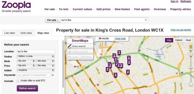
4. Give the user control over their viewing options and provide the ability to sort results (for example, by relevancy, popularity, rating, or date listed).
Zoopla, a property site, shows its results in a list view by default, but users can also easily tab to grid and map views:
Form and filtering options are a good starting point when it comes to search UX and optimising search results, but there are more aspects to consider. In the next post on the subject, we will discuss what to do if the search returns no results, while the final post on search will consider what data to display in the individual search item result.
Do you need help improving your UX? Contact Matthew, our Technical Director, today on +44 207 125 0160 or drop him a line on matt@bitzesty.com for a free consultation.
Do you need help with your application?
At Bit Zesty, we specialise in building and maintaining bespoke software and integrating AI into existing applications.
Looking to build an application, but unsure of the price? Keen to discuss our experience, processes and availability?